
In my previous blogposts (part 1, part 2, part 3) we looked into how we can analyze Bearable data export with R.
Today let’s look at how we can do something similar in python.
Python and Jupyter Labs
Python is a viable alternative to R for statistical programming and it’s gaining in popularity. This is in part thanks to the awesome Jupyter Labs (formerly Jupyter notebook) and libraries like pandas, scipy and matplotlib.
Steps by day
We start by importing a few libraries from above.
import pandas as pd
import matplotlib.pyplot as plt
Loading the data and selecting for step counts is pretty straightforward:
data = pd.read_csv("./data/latest.csv")
df = data[data.detail == "Step count (steps)"]
Let’s build a dataframe with only the values we need:
df2 = pd.DataFrame({
    "date": pd.to_datetime(df.date),
    "steps": pd.to_numeric(df["rating/amount"])
})
Note that pandas can parse the datetime without any help, so this is a lot shorter than in R.
Show me the data:
plt.xticks(rotation = 45)
plt.bar(df2["date"], df2["steps"])
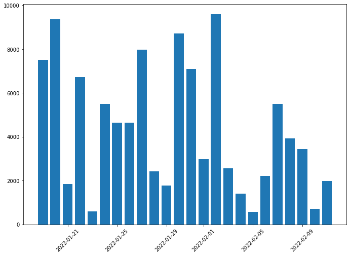 (The data is generated, for privacy reasons.)
Mood by date
Import our required packages:
import pandas as pd
import matplotlib.pyplot as plt
from scipy.signal import savgol_filter
Let’s select for mood:
df = data[data.category == "Mood"]
And build a new dataframe:
df2 = pd.DataFrame({
    "date": pd.to_datetime(df.date + " " + df["time of day"]),
    "mood": pd.to_numeric(df["rating/amount"])
})
Here comes the part which is easier in R. We can just type + geom_smooth(), and get a smooth line with the confidence intervals. We have many options to build a smooth line, but very few to get the confidence interval as well.
ysmoothed = savgol_filter(df2["mood"], 10, 3)
Show me the data!
plt.rcParams["figure.figsize"] = (11.44, 8)
plt.gca().set_ylim(0, 10)
plt.xticks(rotation = 45)
plt.plot_date(df2["date"], df2["mood"])
plt.plot(df2["date"], ysmoothed)
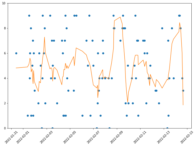 (The data is generated, for privacy reasons.)
