
I use the Bearable app to track my mood, energy levels and sleep quality.
Bearable app gives you rudimentary data analysis about the factors influencing your metrics. However we can do better:
R
R is a programming language for statistical analysis. We will use R to extract useful information and visualize your data.
Let’s build some graphs
Steps by day
Now this is pretty easy, we have to select the “Step count (steps)” labelled fields. Let’s use the tidyverse package to do so:
library(tidyverse)

data <- read.csv("./data/latest.csv")
df <- data %>% filter(data$detail == "Step count (steps)")
The rating.amount field carries the data we are looking for.
Unfortunately Bearable decided to use a weird format to give us the date, such as 22nd Jan 2022. This is not ideal for us, as R doesn’t understand that it is a date.
Using some regex and string splitting, we are going to make it understand:
# Extract date.
get_date <- function(df) {
  df$split_date <- strsplit(df$date, " ")
  df$day <- sub("^\\D*(\\d+).*$", "\\1",  df$split_date)
  df$month <- sapply(df$split_date, "[[", 2)
  df$year <- sapply(df$split_date, "[[", 3)
  for (v in 0:nrow(df)) {
    d <- paste(df$year[v], df$month[v], df$day[v], df$time.of.day[v], sep = " ")
    d <- str_trim(d)
    format <- "%Y %b %d %H:%M"
    if (is_empty(df$time.of.day[v]) || df$time.of.day == "" ) {
      format <- "%Y %b %d"
    }
    df$date[v] <- parse_datetime(d, format=format)
  }
  return(as.POSIXct(df$date, format="%s"))
}
Let’s make sure R understand the type of the fields:
df$date <- get_date(df)
df$rating.amount <- as.integer(df$rating.amount)
Now we can Plot the number of steps we took by days:
ggplot(data = df, aes(x = date, y = rating.amount)) +
  geom_bar(stat = "identity") +
  labs(title = "Steps", x = "Date", y = "Steps")
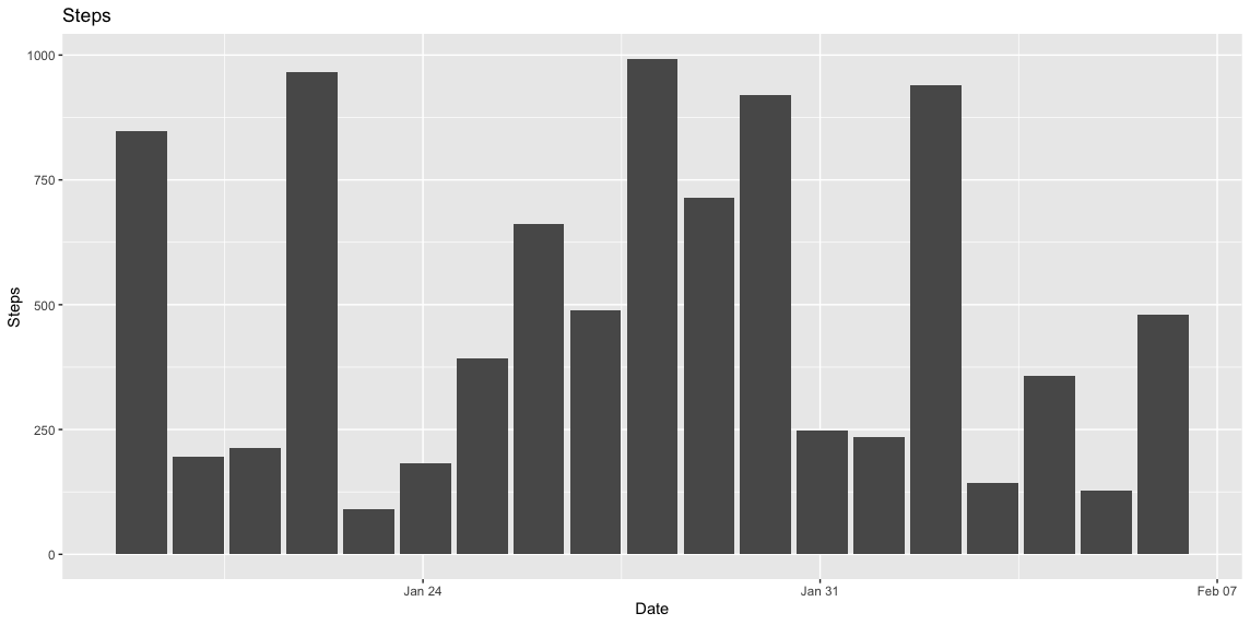 (The data is generated, for privacy reasons.)
Mood by time
Let’s select for mood:
df <- data %>% filter(data$category == "Mood")
Just like before, rating.amount is what we are looking for:
# Wrangle data.
df$rating.amount = as.integer(df$rating.amount)
df$date <- get_date(df)

# Plot.
ggplot(data = df, aes(x = date, y = rating.amount)) +
  geom_line(stat = "identity") +
  stat_smooth() +
  ylim(c(0, 10))
  labs(title = "Mood", x = "Date", y = "Mood")
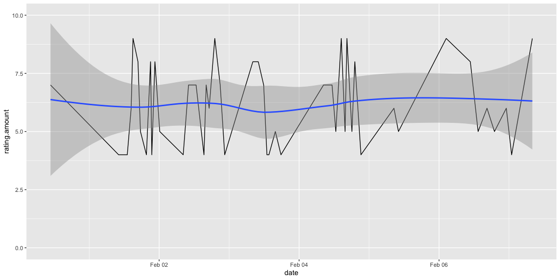 (The data is generated, for privacy reasons.)
Next time
In the next section we will make R understand factors, and learn how to calculate and visualize correlations between them.
