
In the previous section we learned how to process Bearable’s date field, and how to visualize some data points.
Today we will learn to look for correlations between factors.
Why are we looking for correlations?
Correlation for logical values help us understand when two factors often happen together. Such as is it often cold when it’s raining? Notice that we don’t know if it’s raining because it’s cold or it’s cold because it’s raining. It’s the often parroted “Correlation does not imply causation” logical fallacy.
Why are we looking for correlations in Bearable data then?
Nevertheless it’s still a useful activity to search for correlations in the Bearable factors: You have more information about your life, and can interpret the data as you please. We can find associations such as “Do I order junk food and watch TV?” or “Is it always raining when I take the dog for a walk?”.
Correlations in Bearable
We start by filtering for factors.
df <- data %>% filter(data$category == "Factors")
Let’s split the factors into the dataframe:
for (v in 1:nrow(df)) {
  factors <- str_split(df$detail[v], pattern="\ \\|\ ", simplify=TRUE)
  for (f in factors) {
    if (f == "|") {
      next
    }

    if (!(f %in% colnames(df))) {
      df[f] <- as.logical(c(FALSE)*nrow(df))
    }

    df[v, f] <- TRUE
  }
}
Now we have the factors for every date, however we probably have multiple dates with the same values, let’s filter them out:
df <- df %>% distinct(date, .keep_all = TRUE)
Drop the values we will not use:
drop <- c("detail", "notes", "rating.amount", "time.of.day", "category", "date", "weekday", "day")
df = df[,!(names(df) %in% drop)]
Let’s drop the factors with only one value. These could be factors you always added, therefor not interesting for us (but will make the visualization cleaner).
# Remove non-sensible values from cor table.
# Based on https://stackoverflow.com/questions/19113181/removing-na-in-correlation-matrix
zv <- apply(df, 2, function(x) length(unique(x)) == 1)
dfr <- df[, !zv]
Reading the correlations table
Let’s ask some questions: “Do I stay in when it’s snowing?”
> cor(df$Sedentary, df$Snowing)
[1] 0.7559289
Well it’s close to 1.0, so that’s promising, is it statistically significant though? Let’s try to build a linear model:
> summary(glm(df$Sedentary ~ df$Snowing))
Call:
glm(formula = df$Sedentary ~ df$Snowing)

Deviance Residuals:
    Min       1Q   Median       3Q      Max
-0.1429  -0.1429  -0.1429   0.0000   0.8571

Coefficients:
               Estimate Std. Error t value Pr(>|t|)
(Intercept)      0.1429     0.1323   1.080   0.3159
df$SnowingTRUE   0.8571     0.2806   3.055   0.0185 *
---
Signif. codes:  0 ‘***’ 0.001 ‘**’ 0.01 ‘*’ 0.05 ‘.’ 0.1 ‘ ’ 1

(Dispersion parameter for gaussian family taken to be 0.122449)

    Null deviance: 2.00000  on 8  degrees of freedom
Residual deviance: 0.85714  on 7  degrees of freedom
AIC: 10.379

Number of Fisher Scoring iterations: 2
It’s in the 95% confidence interval (p < 0.05), so we can safely say it’s true. Let’s assume I’m not a wizzard and me staying inside doesn’t affect the weather, so we can be sure that I stay inside if it’s snowing. You get the idea.
Visualization
You can type cor(dfr) and get the correlation between the factors, however chances are that it’s huge and very hard to understand.
Let’s visualize the correlations. There are many projects to do that, I like corrplot. You can install it using package.install("corrplot").
library(corrplot)

corrplot(cor(dfr),      # Correlation matrix
         method = "square", # Correlation plot method
         type = "full",    # Correlation plot style (also "upper" and "lower")
         diag = FALSE,      # If TRUE (default), adds the diagonal
         tl.col = "black", # Labels color
         bg = "white",     # Background color
         title = "",       # Main title
         col = NULL)
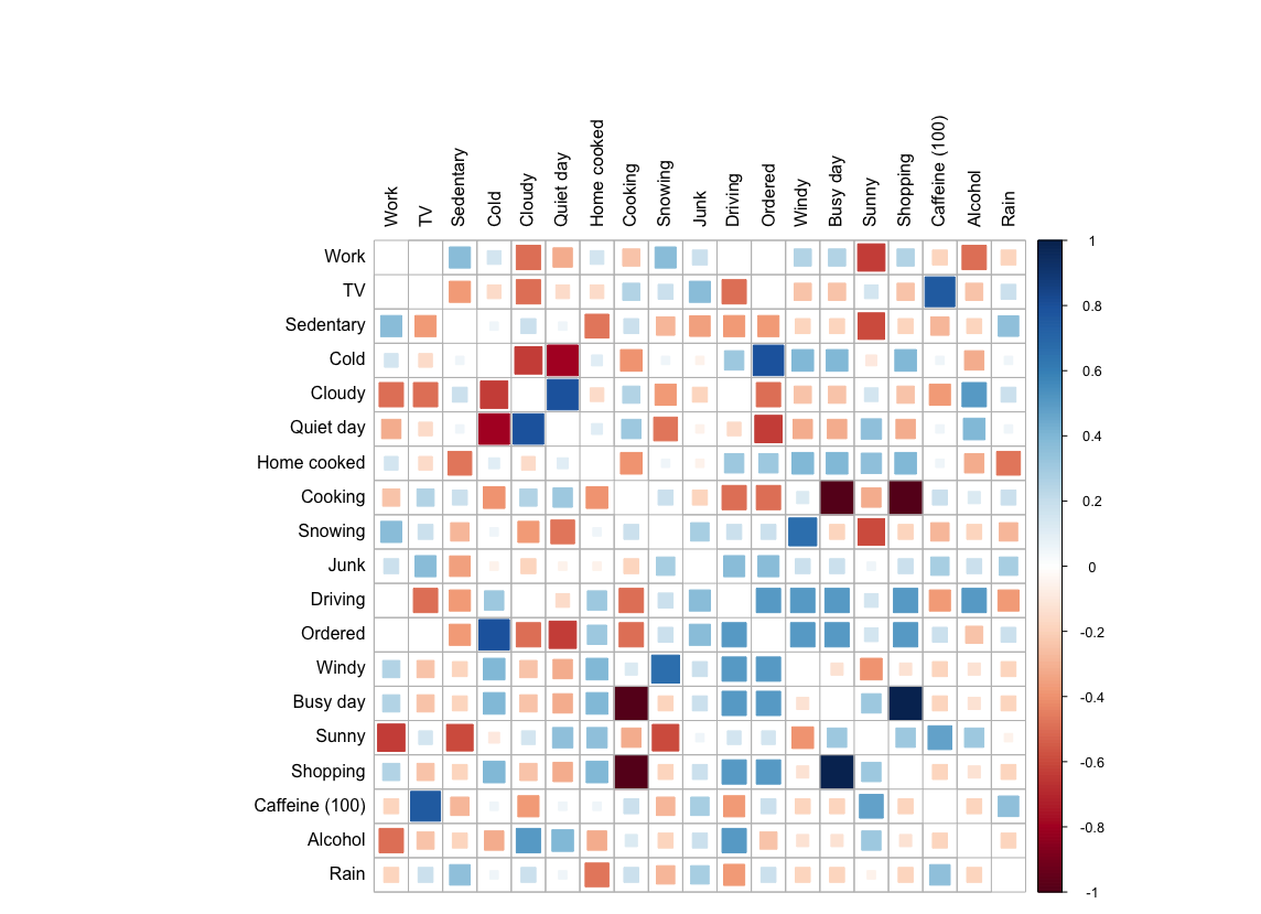 (The data is generated, for privacy reasons.)
Adding some more data
Factors are not the only data we can plot this way, you can also change the first line and filter for supplements as well:
df <- data %>% filter(data$category == "Factors" | data$category == "Meds/Supplements")
In the next part we will learn how to visualize factors based on your mood.
